Redesigned, and simplified SIM Swap
TELUS
Desktop, Mobile | 3 weeks, 2021
Redesigned, and simplified SIM Swap
My role as a Product Designer contributed in research, design, and delivery to the engineering team.
I collaborated with a Product Manager, Content Strategist, Engineers, and Call Centre agents.
When things don't go right, customers prefer to call or have a store dealer do it.

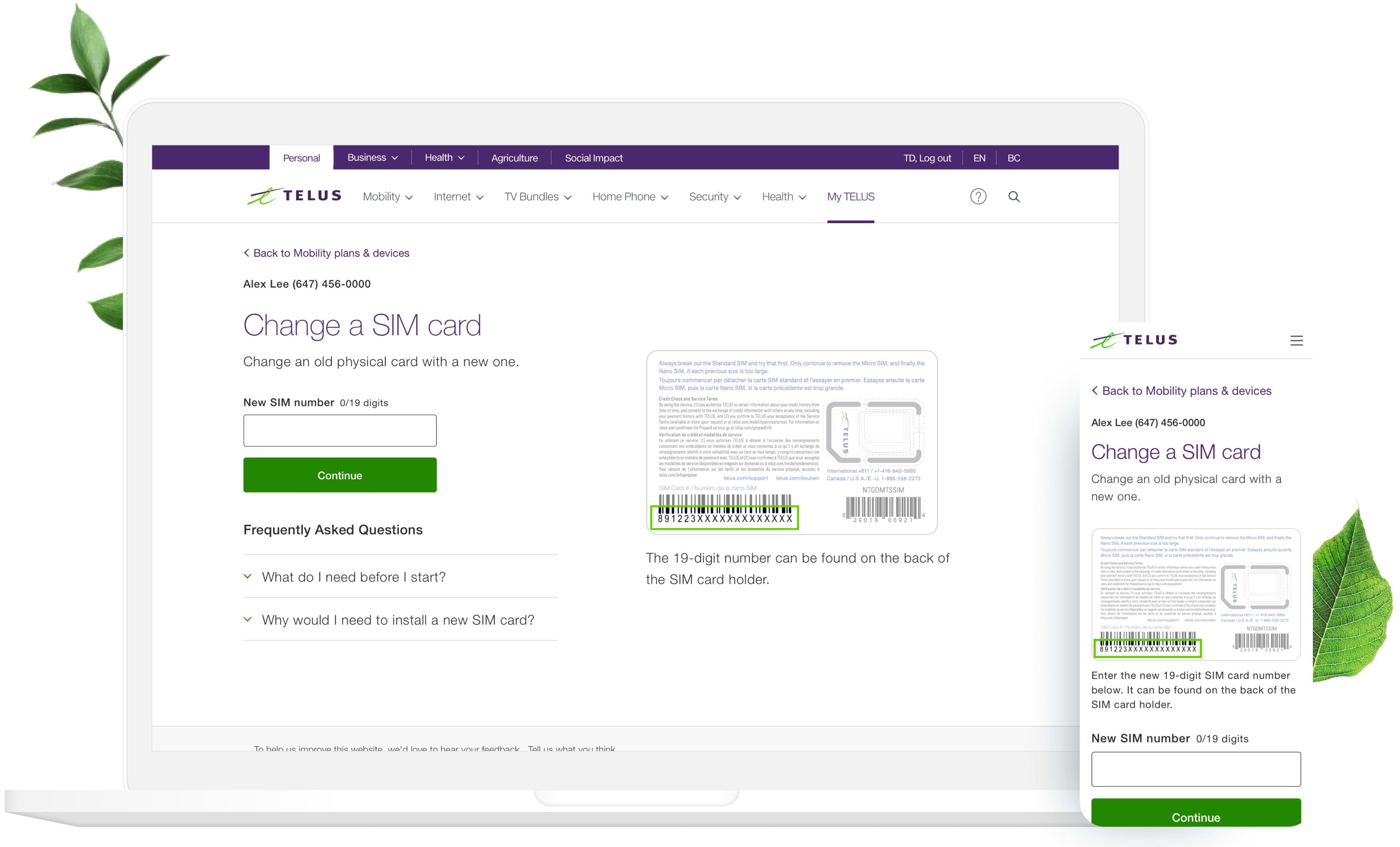
Before redesign SIM swap page
After noticing a number of negative VoC comments and analytics for this, I collaborated with my Product Manager to fix the low conversion rate.

Notice the massive drop off on step 1
KPIs:

I needed to dig deeper and understand why customers have trouble with this flow. I started by reading all SIM swap related feedback in the voice of customer slack channel, audited the current experience so I could identify opportunities and gaps, interviewed call center agents to understand what customers need help with.
Key findings:
Wouldn’t it be great if you didn’t have to enter the numbers in the first place? I recommended the option to scan when using their phones to change a SIM, but due to technical constraints and privacy concerns, this wasn’t feasible.

It seemed that the root cause was the SIM card itself. According to Miller's law, that the number of objects the average person can hold in working memory is about seven. Plus or minus 2. The current SIM card did not support that law. I proposed changing the sim card to support human working memory. It was liked by the team, but because of the short timeline, this solution wasn't feasible at this time.

Considering all our other options were not possible due to constraints, I was limited to optimize only the webpage. I collaborated with a content strategist to create simpler and clearer version of this page. This included exploring different language, highlighting the SIM number upfront so it's clear which number to enter.
This wasn't all. I also noticed opportunities throughout the entire SIM Swap flow, and suggested other improvements to make the experience even more dynamic and simpler.
Design considerations:
Walkthrough of the final designs
This was really satisfying because projects often take months. But I was able to help TELUS and their customers save time and money through some simple UX improvements. All of this in just 3 weeks!
This impacts TELUS by potentially reducing over 10.5K calls / month, which equals to savings of $1.5M each year.

Post launch analytics
People often think adding more things will make a design clearer. In reality, removing noise can be helpful.
Keep it simple.

