TELUS

Improving onboarding UX to save TELUS $1.2M/year

Desktop, Mobile | Jun - Sep 2022

image

Welcome page for new My TELUS customers

TELUS is one of the leading telecommunications provider in Canada. Millions of Canadians choose TELUS for their mobility, internet, security, TV and business services.

My role as a Product Designer contributed leading end-to-end, from kickoff, planning, research & strategy, design, and delivery.

I collaborated with other Designers, Product Managers, Engineers, Content Strategists, and Call Centre agents.

Background

My TELUS is where customers can manage their services.

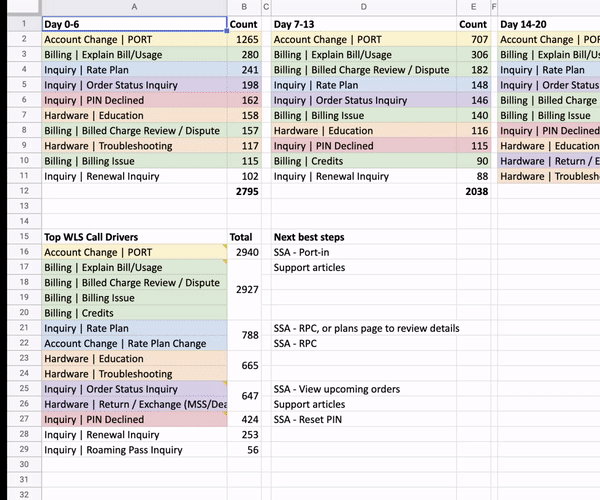
Earlier in 2022, TELUS had a massive company-wide initiative to improve the onboarding experience for new customers. This is because customers often have to wait 1-2 hours each time they call for support. If we can design a positive first impression through successful onboarding, we have the potential to reduce 8.3K calls per month which costs TELUS $1.2M each year.

My TELUS Overview

Challenge

How might we improve onboarding experience for new B2B customers?

goals

Increase confidence in B2B customers to use My TELUS so they don’t have to call.

KPIs we measured:

  • Reduce number of onboarding related calls
  • Improve VoC
  • Increase customers with 2+ products
  • Increase customer retention
image

My (high-level) design process

Research > Design > Deliver

image

research

Many different opportunities identified across the customer journey.

To understand the problem space and customer pain points, I reviewed analytics, audited existing onboarding experience, read VoC comments, interviewed call centre agents, and 6 business customers.

Key findings:

  • Guided Onboarding: Customers want a guided process that sets them up for success
  • Porting-in: Instructions provided are not clear when it comes to transferring their existing number to TELUS
  • Billing concerns: Unsure when promotional credits will be applied, or why bill is higher than expected
  • Personalization: Customers want offers and recommendations based on their existing usage and shopping patterns
  • Conversational CX: Customers want a quick way to speak with real human for support. Wait times are extremely frustrating
  • Poor Shipping & Delivery: No order updates are sent
  • Navigation: Lack of IA optimization causes confusion where to find actions
  • Offboarding: Business customers are often hiring new employees and letting go of previous ones. Customers want to easily remove / add employees to their My TELUS account

competitor analysis

The expected onboarding experience.

To understand what customers are used to already when it comes to Onboarding, I analyzed multiple onboarding studies, best practices, and competitors. This step is important because "users spend most of their time on other sites. This means that users prefer your site to work the same way as all the other sites they already know." - Jakob's Law.

Typical patterns:

  • Welcome messages
  • Checklists
  • Tooltips
  • Progress bars
  • Product tour
  • Persona-based onboarding
image

Personas & journey map

Research helped identify our personas, along with an opportunity to communicate findings through a journey map.

After synthesizing the findings, I created primary and secondary personas. The findings also helped me create the journey map. After many team sharebacks, this enabled us to better empathize with our customers. It was later used in ideation workshops and cross-functional alignment sessions.

Ideation

Facilitating ideation sessions with my team.

After giving the team a brief intro on our research findings, we did the crazy 8s design sprint exercse. This helped with team communicate their ideas and build trust throughout the process.

User flows

Creating user flows to help communicate a simple and efficient design.

After completing an action, customers will be able to return back to the page from the Overview page until all actions are completed. This also helped visually communicate and align the design vision with the cross-functional team.

Explorations

Exploring and optimizing onboarding actions for clear experience.

Thanks to the research earlier, I was able to leverage those ideas and create some of my own. Here I spent a lot of time with the content strategists to figure out the flow of the actions, along with the labels and description for each one.

First approach

Showing all actions at once.

Pros:

  • Easy for engineers to build
  • Sets user expectations right away

Cons:

  • Potentially overwhelming number of actions
  • Not very guided

Second approach

One step at a time.

Pros:

  • Very guided experience
  • Minimal distractions

Cons:

  • Hard to build, many edge cases to consider
  • Might cause drop off due to high number of steps

additional changes

Onboarding actions wasn’t the only change. I also redesigned the end-to-end "transfer your existing number" flow.

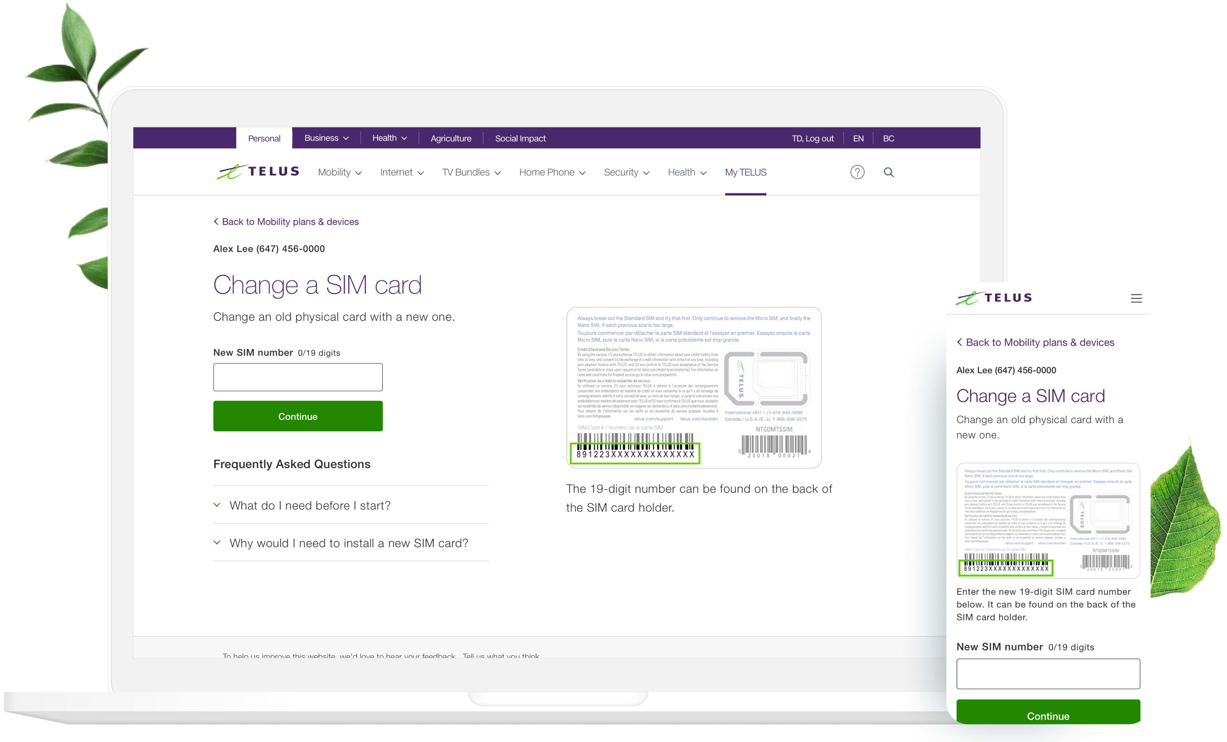
Knowing most of the customer calls come for one reason, that being port-in, this flow had to be optimized on it’s own.

Considerations to:

  • Adding clarity
  • Reducing cognitive load
  • Improving readability
  • Supporting multiple port-in transfers
  • Updating to the new design system to improve visual hierarchy, use of color, and spacing

before

after

usability testing

We found a winner!

Users preferred the dynamic onboarding approach much more than the all static options. This validated my hypothesis about potential cognitive load caused by multiple tasks shown at once.

Other insights:

  • Users did not like horizontal scrolling on desktop, as it was not intuitive
  • Most likely to skip options that aren't important right away
  • Found it clear how to transfer multiple numbers
image

Final designs

Balancing technical feasibility, business viability, and customer desirability was an art and science.

There were many constraints throughout this project. It required a ton of collaboration across cross-functional teams. But thanks to many explorations, sketching, ideation, testing, and feedback sessions, the team agreed on a solution that worked.

First login onboarding experience for new My TELUS customer

deliver

Handing off designs to the engineering team.

I provided pixel-perfect mockups, with accessibility annotated so that our customers have an accessible, and easy-to-use experience when Onboarding My TELUS to manage their services.

image

estimated impact

Reducing 8.3K calls / month, saving $1.2M / year.

At the time of creating this case study, this work was in development. I have high confidence in the success of the project. Usability testing showed customers were able to easily set up their new device without the need for extra support.

learnings & recommendations

Plan ahead, push more for the users, design with the future vision in mind.

  • Proactively invite relevant teams involved in the project during kickoff. It will save many hours later on when everyone has set responsibilities and awareness.
  • Finding business customers for interviews took a few weeks, which slowed us down a bit. Next time, I’d do continuous discovery throughout the year for projects in the roadmap.
  • Push more for user experience when technical challenges exist, communicate its impact.
  • Don’t just design an MVP. Design for north-star vision. Roll out in smaller chunks over time.

See other projects

image

Optimizing SIM Swap flow to increase conversion rate from 38% to 76%

image

Designing the Lumen Design System from 0-1